A beige bathroom can feel bright and enveloping without looking uniform. The secret lies in differences of texture, tonal value and reflection. Our proposal combines a sandy mineral base with a few warm metallic accents, assigning each element a precise role.
01
Choose beige in the actual light
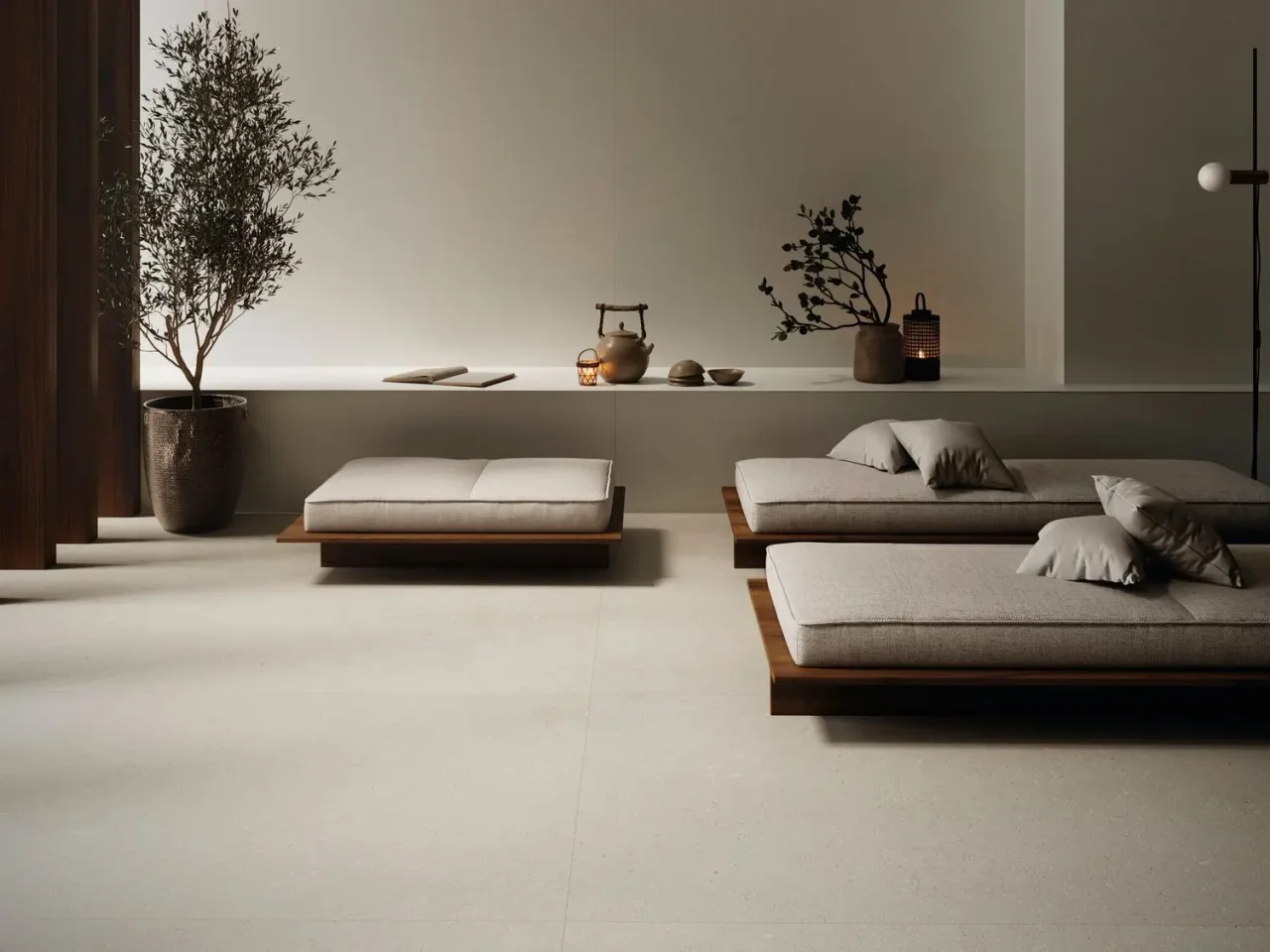
A pinkish beige and a greyish beige tell different stories. Look at the finish vertically, beside the furniture and white sanitary ceramic. In a room mainly lit in the evening, artificial lighting becomes the first selection criterion.
Keep a sample on site for several days. A large surface amplifies a nuance barely noticeable on a small tile. For the floor, seek colour consistency while separately checking the properties suited to its use.
02
Create depth with three textures
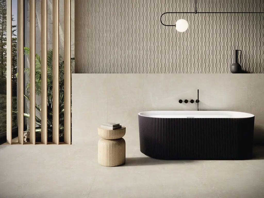
A subtly varied mineral surface, discreetly grained furniture and a plain textile are enough to enrich the palette. Relief can appear on just one wall behind the basin. The calmer surrounding surfaces give it presence.
If the tiles already have plenty of movement, choose restrained wood. Conversely, almost plain ceramic can accommodate a more expressive species. This hierarchy prevents a gentle atmosphere turning into competing patterns.
03
Use bronze as punctuation
A warm metal draws attention even in small quantities. Start with the tap, then consider the waste, accessories and flush plate. Two finishes called bronze can have different undertones: judge their relationship with samples side by side.
The tap can provide the main accent while the WC plate blends into the wall. This restraint reduces bright points visible from the entrance. If you repeat a metal, keep the strength of reflection consistent between the two areas.
04
Avoid making the entire room tone-on-tone
Introduce measured contrast: shadow beneath the vanity, a thin mirror frame or a deeper-toned niche. This gives the scheme visual depth. Contrast can come from volume and does not always require another colour.
For an apartment or villa in Tunisia, bring photographs of the light and references for retained materials to your appointment. EDIFIS can then guide comparisons towards concrete combinations rather than a colour seen only on screen.
Before you decide
- Compare beige undertones.
- Keep one visually calm surface.
- Check metallic finishes side by side.
- Plan contrast in volume or tonal value.
The essentials
Your questions, our guidance.
Does beige require gold taps?
No. Subtle chrome, brushed metal or graphite can also work. Choose according to the light and desired contrast.
Can two different beige tiles be combined?
Yes, if the difference is intentional: for example, a calm floor and textured wall. Also check their thicknesses where they meet.
From idea to project
Discover at EDIFIS
Explore surface finishesCompare THG Paris finishesView Geberit flush platesConfirm references, configurations, finishes and availability for your project.
Documentation & references
EDIFIS design advice. For specifications and installation, consult the documentation for the selected reference.
Cifre Cerámica · 2026 inspiration and collections ↗