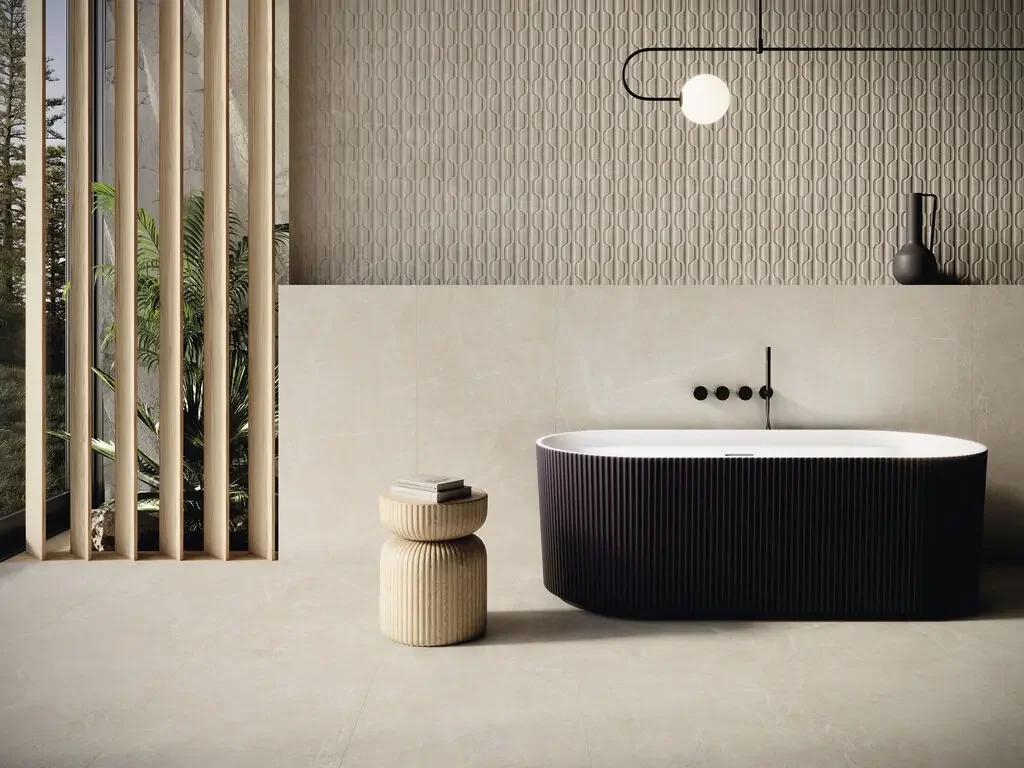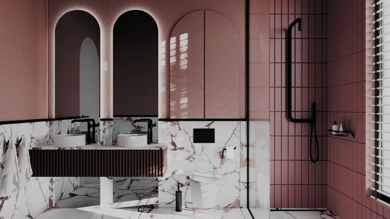
Colour drenching wraps a room in one colour or a family of closely related shades. In a bathroom, it requires coordination between materials serving different uses. The challenge is to create visual continuity while retaining depth and useful reference points.
01
Define a realistic colour family
Trying to match paint, tiles and furniture perfectly can lead to disappointing differences. Prefer a coherent family with one main shade and two deliberate variations. A slightly deeper furniture tone can anchor the composition.
Observe these materials in their actual orientation: a vertical door and a horizontal top do not receive light the same way. Appearance also changes between matt and gloss. Accept these variations when they add depth to the scheme.
02
Compose with joints and boundaries
Grout becomes very visible within a unified envelope if it contrasts strongly with the tile. Compare samples of cured grout, then view the grid from a distance. A shade close to the finish can soften the reading without pretending joints disappear.
Draw material changes around the shower and areas exposed to water. Colour-matched paint is not interchangeable with a system intended for a directly sprayed wall. Colour continuity can cross different technical solutions.
03
Choose the tap’s degree of contrast
Metal taps reflect surrounding colours and can integrate subtly. A black or very pale tap instead creates a pronounced silhouette. Decide whether the water point should blend in or become the main visual reference.
The Geberit plate involves the same decision. Its geometry stands out quickly on a plain wall; against a coloured textured wall, a restrained finish can calm the composition. Nevertheless, ensure the control remains easy to identify and use.
04
Add depth without adding colour
Work with shadows below suspended furniture, the recess of a niche or the edge of a mirror. These details create successive planes. One textured surface can also add character, provided every wall is not overloaded.
To assess balance, look at a photograph of the project in greyscale. This simple check reveals tonal contrasts and areas that merge. Then return to actual samples to approve the colour’s emotional effect.
Before you decide
- Choose a dominant shade and variations.
- Compare grout after drying.
- Distinguish visual continuity from wall systems.
- Keep reference points around controls.
The essentials
Your questions, our guidance.
Must monochrome be perfectly uniform?
No. Differences in texture, reflection and depth bring the composition to life. The goal is perceptible coherence, not absolute identity.
Can white sanitary ceramic remain?
Yes. It provides a clear contrast and can become a reference point within a deeper-toned envelope.
From idea to project
Discover at EDIFIS
Explore Cifre finishesDiscover Geberit flush platesDiscuss your paletteConfirm references, configurations, finishes and availability for your project.
Documentation & references
EDIFIS design advice. For specifications and installation, consult the documentation for the selected reference.
Cifre Cerámica · 2026 collections ↗