Metal covers little surface but immediately attracts the eye. Its colour, sheen and texture can warm a light stone, emphasise furniture or make a scheme feel overcrowded. Start choosing tapware with the whole room and your care habits in mind.
01
Chrome: a bright point of reference
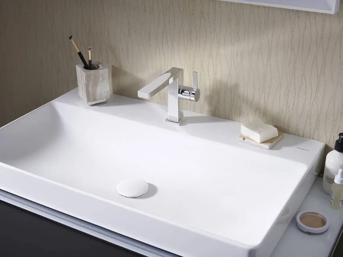
Polished chrome provides a clear reflection. It can support a discreet composition in a light bathroom and become more visible on a dark wall. Its aesthetic value also comes from neutrality: it leaves more room for marble veining or cabinet colour.
Do not confuse neutrality with the absence of a choice. Spout shape, body proportions and control design remain decisive. A well-proportioned chrome mixer often gives a more convincing result than a spectacular finish poorly coordinated.
02
Matt black: drawing the lines
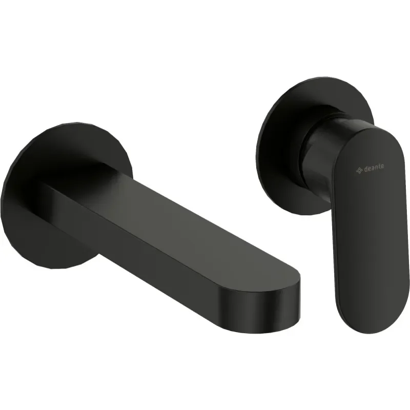
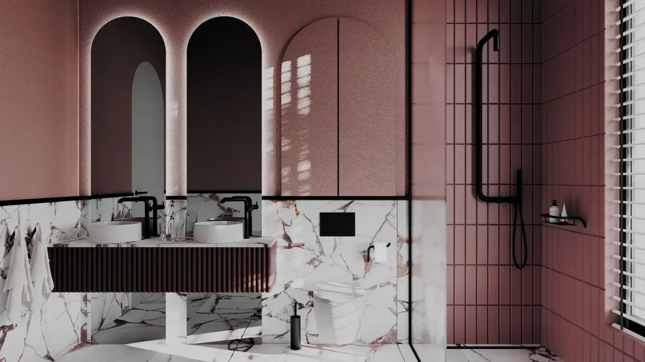
Black works like an outline. It visually connects taps, screen profiles and accessories provided their thickness and positions are controlled. Limit repetition in a small room: a spout and a few details may be enough.
Light deposits can stand out more on a dark finish. Allow for regular wiping and care according to the instructions. A black coating is not automatically cleaned like chrome; avoid abrasive products unless the manufacturer explicitly permits them.
03
Warm metals: compare them in person
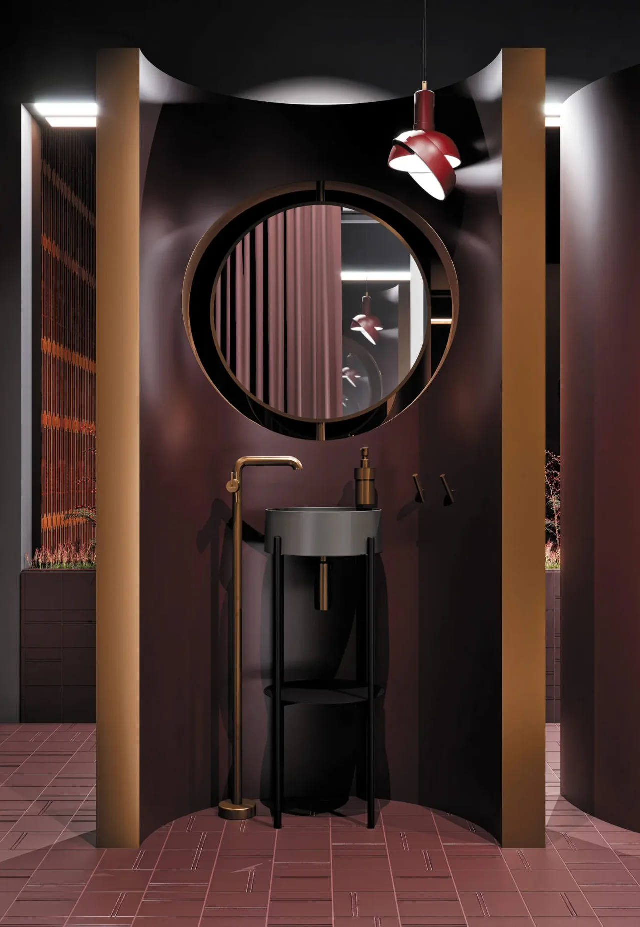
Bronze, nickel, brass and gold cover very different shades. THG Paris, for example, distinguishes several traditional and PVD finishes. A commercial name alone cannot predict a neighbouring product’s appearance. Ask for the exact reference and a sample when a precise match is required.
On beige stone-effect material, a warm shade creates continuity. On white marble, it provides more contrast. A brushed surface diffuses reflection differently from a polished one: compare them under the same light and orientation.
04
Coordinate without making everything identical
A composition can include two metals, but assign each a clear role. For example, one dominant finish for water points and another for lighting. Avoid accidental differences between nearby objects such as tap and waste.
Before ordering, bring tapware, WC plate, wastes, accessories and profiles onto a single board. Identify visible and hidden elements. This prevents spending on a concealed detail while overlooking a connection in full view.
Before you decide
- Gather the visible metal elements.
- Compare polished, matt and brushed under one light.
- Approve finish references.
- Plan suitable care.
The essentials
Your questions, our guidance.
Does PVD describe a colour?
No. It is a surface-treatment process that can produce different shades. Characteristics and care instructions depend on manufacturer and reference.
Does black suit every bathroom?
It can suit many schemes, but its contrast must be accepted and care requirements checked against the home’s water and use.
From idea to project
Discover at EDIFIS
Deante tapwareTHG Paris finishes and collectionsConfirm references, configurations, finishes and availability for your project.
Documentation & references
EDIFIS design advice. For specifications and installation, consult the documentation for the selected reference.
THG Paris · matt graphite PVD ↗THG Paris · matt gold ↗