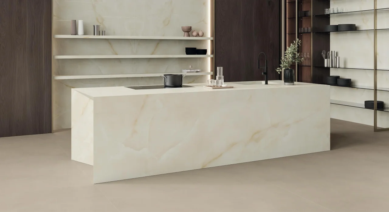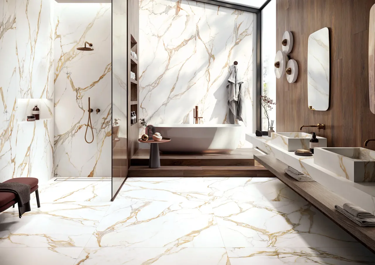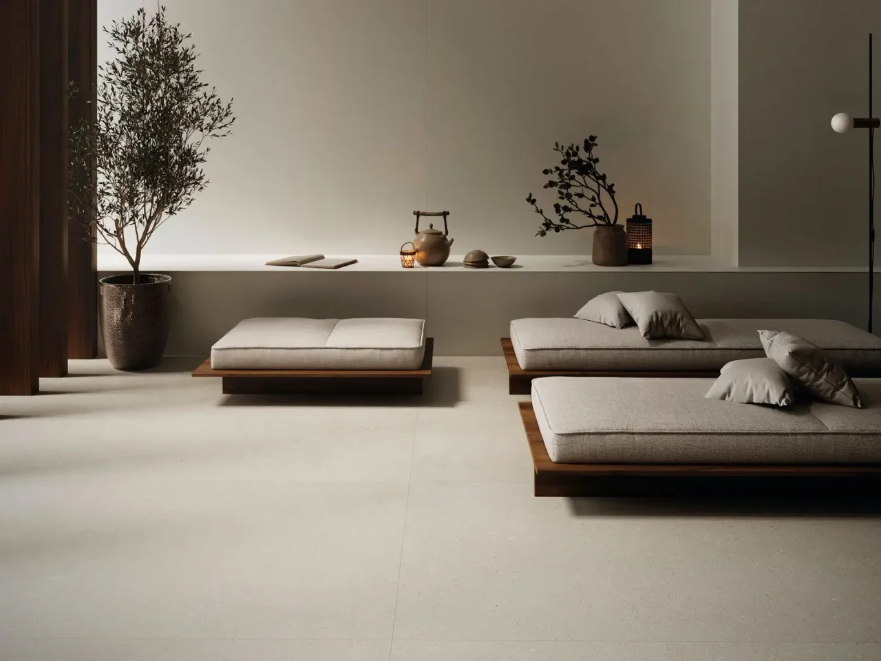
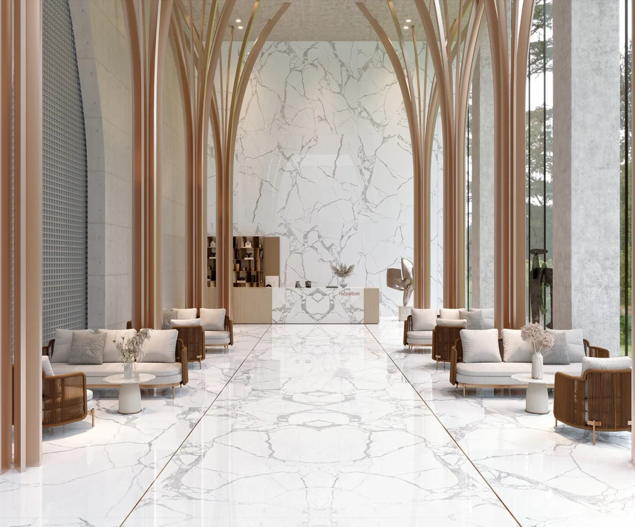
A checkerboard immediately gives rhythm to a kitchen or bathroom. It can recall a classical interior or become thoroughly contemporary through its colours and scale. Our approach softens it with considered contrasts and lets the floor structure the setting.
01
Start with a pair of tonal values
Black and white gives a clear contrast. Beige combined with brown or warm grey creates a softer difference. The contrast should remain visible from a distance, but need not be maximal for the pattern to work.
Compare the two references side by side with their actual finishes. A highly glossy tile and a matt one also contrast in reflection. Check that this difference is intentional and both products suit the installation area.
02
Choose the scale from the plan
A large module gives a broader design; a small module multiplies the rhythm. Count the alternations visible between furniture, around the WC and in front of the shower. The choice must work on the floor actually left exposed, not only on an empty plan.
Diagonal laying changes perimeter cuts. It can create an interesting effect but requires careful layout near thresholds. Also draw how the pattern meets the doorway and neighbouring room's covering.
03
Calm the walls and taps
When the floor carries a strong design, plain walls make it readable. A heavily veined splashback or a succession of niches may introduce too many directions. Keep a second pattern only if it has a clear role in the composition.
Metal can pick up a checkerboard tone: chrome for a cooler contrast, warm metal for earthier shades. Simple taps make the ensemble more contemporary. A more classical model needs particular attention to furniture and mirror proportions.
04
Coordinate references before installation
Two tiles with the same nominal format can differ in actual dimensions or thickness. Check their combination with supplier and tiler. The project should specify references, joint width and accepted tolerances.
Keep enough pieces of each colour for future needs, as calculated for the project. Identify batches and the laying plan in the file. This makes future intervention easier without disrupting the pattern's rhythm.
Before you decide
- Compare contrast from a distance.
- Check tile dimensional compatibility.
- Draw cuts at thresholds.
- Let the walls support the pattern.
The essentials
Your questions, our guidance.
Can a checkerboard suit a small bathroom?
Yes, if its scale and contrast remain consistent with the visible surface. A simulation including sanitaryware helps decide.
Are two very opposing colours essential?
No. Two close mineral shades can create a gentle rhythm. Check that they remain distinct under the intended lighting.
From idea to project
Discover at EDIFIS
Compare EDIFIS coveringsDiscover TaginaPrepare the tile layoutConfirm references, configurations, finishes and availability for your project.
Documentation & references
EDIFIS design advice. For specifications and installation, consult the documentation for the selected reference.
Tagina · decorative patterns and compositions ↗